
 Yahoo Sport


Ranked! The 21 BEST club badges in world football
Phwoooooaaaaar! David Beckham's Inter Miami FC have unveiled their spanking new badge ahead of a proposed first MLS season in 2020. Here are some more beauties from around the world...
21. Asante Kotoko

There’s only one way to start: with an evil porcupine.
Ghana’s Asante Kotoko were named Africa’s Club of the Century in 2000 by football nerd-do-wells IFFHS (International Federation of Football History and Statistics), ostensibly based on results. We know the real reason: that porcupine struck terror into IFFHS’s cold, mathematical hearts. After all, the club’s motto means, ‘Kill a thousand and a thousand more will come’. A-porc-alypse!
Kotoko also have an unofficial nickname that has previously resulted in the proposed building of a Fabulous Arena, and their women’s team being called Fabulous Ladies of Asante Kotoko. Which is just delightful.
20. Boca Juniors
They’re going to need a bigger badge. But in the ’70s Boca started adding a star for every title they won, and damn it, they’re not going to stop now.
19. Inter Milan
To win the European Cup three times, a club needs a classic crest. That’s why Nottingham Forest won it only twice. Inter’s emblem, though, has a timeless design, despite a pointlessly minor 2014 rebrand that scaled new heights of pretentiousness.
Inside ever-decreasing circles sit the letters I, M, F and C in an Escher-like arrangement. Which letter’s on top? Which is bottom? Who knows? They’re intricately interwoven, whereas other clubs’ attempts at a similar design can create a clustered mess.
18. Bohemians 1905
Moving from the sublime to the ridiculous, the complex to the simple, Milan to Prague, this is the intriguing badge worn by Czech top-flight outfit Bohemians 1905. It’s a kangaroo. In central Europe. Frankly, FFT agrees with the badge: the less explanation, the better.
Oh, fine: they adopted the nickname after a 1927 tour of Australia ended with Bohemians being given two kangaroos. Happy now?
17. Gandzasar Kapan

Few crests are more epic than this effort from the Armenian Premier League (we researched hard, OK?). A bear clutching a key atop a retro football resembling a planet is stirring stuff. The only shame is that ‘Ganzasar’ actually means ‘treasure mountain’. Now that’s a badge we want to see.
16. Orlando Pirates

Where St Pauli talk the talk, Orlando Pirates walk the walk. The South African giants’ crest has a skull ’n’ crossbones that wouldn’t look out of place on a Motörhead LP, having thankfully run with the most well-known of their many nicknames, rather than the somewhat less intimidating ‘Happy People’.
15. Chornomorets Odesa

We like this badge for one reason and one reason only: the Adidas Tango. While every other club badge in the world features the tried and tested models – your classic leather football with volleyball-esque lines, or a ‘modern’ white-with-black-polygons design that hasn’t seen action since the ’70s – Chernomorets elect for the greatest ball ever created in sport. Shine on, you crazy Ukrainian diamonds.
14. Roma
This famous crest has everything: originality, history, wolf tits… even the shield’s shape and colour are perfect. Just one problem: the wolf’s expression. Rome’s story tells of an animal-rearing Romulus (who created the city) and Remus (who didn’t) – it doesn’t mention an apparently excruciating breastfeeding encounter, made 10 times more awkward by the artist walking in at precisely the wrong moment. Still, the old girl is balancing well for a wolf with three legs.
13. Kilmarnock
Finger pistols, Latin, a pair of friendly squirrels – what’s not to like?
12. CFR Cluj
It’s coming right at us! The story goes that in the first-ever film screening, Train Pulling Into A Station, audiences panicked and fled, thinking said train would hit them. The story isn’t true – it wasn’t even the first film screening – but at least Cluj are keeping the legend alive.
11. Oldham Athletic
“Oi. You lookin’ at my bird?”
10. Liverpool
The famous Liverpool FC crest teeters on being overdone: with the Shankly Gates, two liver birds, the club’s full name, its founding date and You’ll Never Walk Alone, there’s a lot going on.
However, it all ties together well, and the finished article is memorable precisely because of its many ingredients. The finest touch comes in the twin flames, iconic yet understated; a newcomer wouldn’t know they’re a tribute to Hillsborough victims.
9. Basel
There’s nothing revolutionary about Basel’s badge of honour; it’s all about doing a simple job well. Its colour matching, clear lettering and subtle variation on the Swiss heraldic escutcheon shape all look exquisite. Best of all is the ball, positioned to look as if it’s orbiting the Swiss champs’ crest.
8. CSKA Moscow
We’re 95% sure this is the cover of an album by The Beta Band. Apparently not. CSKA’s emblem is bloody brilliant, though, even if prolonged exposure to it can turn you communist.
7. Birmingham City
It’s a nice bonus when a club crest is instantly recognisable from its outline, as Manchester United or Tottenham Hotspur will tell you. Birmingham City’s symbol has changed a couple of times over the years, but this ball-and-globe design has remained, primarily because it’s a classic. All the info is there and well presented. Pity about that terrible attempt at a map.
6. Guangzhou Evergrande
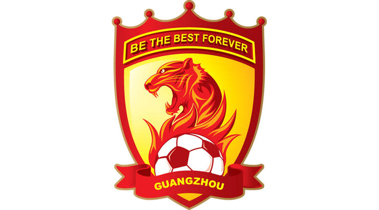
We like to believe this dramatic logo was created for a job interview by a manager not afraid to use PowerPoint.
“The directors expect the club to attain a respectable league position this season. If you think you can achieve greater things, the board is willing to back you by increasing the wage budget. What are your expectations?”
“BE THE BEST FOREVER.”
“The board is willing to increase your wage budget by £3.50 per week.”
5. Universidad de Guadalajara

With all due respect to The Hairy Ones (real nickname), because they did after all create it, this badge deserves better than the Mexican second tier. In fact, any other club calling themselves The Lions, from Aston Villa to Sporting, should feel ashamed in its presence.
Leones Negros means ‘Black Lions’, of course, although you could easily mistake this image for a very angry sun. It makes for a better emblem than yet another nickname of theirs would: The Academics. Students, huh? Maybe that’s why they’re called The Hairy Ones.
4. Sampdoria
At FFT we adore this crest, in spite of – or because of – the silhouette depicting a pipe-smoking schnauzer wearing a Scotch bonnet. Baciccia (for ’tis his name) is a ‘wolf of the sea’, befitting Genoa’s status as Italy’s main port city. Props, mind, to the person who realised Baciccia looks most like 2D from Gorillaz.
3. FC Köln
Köln’s crest is so glorious, so metal, its existence reflects badly on other German teams – and not just because their own efforts are mostly toss.
The original Hennes the Billy Goat was not, in fact, taller than Dracula’s castle (it’s actually Cologne cathedral). It was, however, a gift to the club from the wife of an English circus owner. Y’know, like most club mascots. And, like most club mascots, the goat immediately urinated all over coach Hennes Weisweiler. Hence the name, hence the badge. Lovely.
2. Lampang FC
Sometimes you have to take your hat off to another club and accept that your badge can’t match one belonging to a semi-professional team in the Thai second division.
Ignore that The Emerald Chariots – and what a nickname that is, by the way – have drawn a black chariot on an emerald background. It’s still a goddamn chariot, and its driver demands respect for managing to get his horse rampaging uphill while controlling a gigantic football. Kudos, Lampang chariot man. Kudos.
1. Ajax
Despite what FFT would have you believe with this blog, elaborate club crests can often be a bit naff. When too much thought goes into a design, its true purpose can go out of the window, replaced by mixed metaphors and PR speak. “The red hue represents ambition”, does it? Or has the club just always worn red, you clowns?
Anyway: Ajax’s crest isn’t like that. In 1928 the Dutch side made Greek hero Ajax their symbol, having presumably decided nobody would recognise Agamemnon. A slightly weird life drawing ran for 60-odd years, until a bright spark had the idea to turn the warrior’s likeness into abstract art.
The result: an intriguing, intricate outline of Ajax, made up of 11 lines, to represent the 11 players in a team. It could be pretentious – yet it isn’t. You can appreciate it just as much without knowing or noticing that element. Touché.
