14 amazing football club badges we wish still existed... and 10 that are truly awful
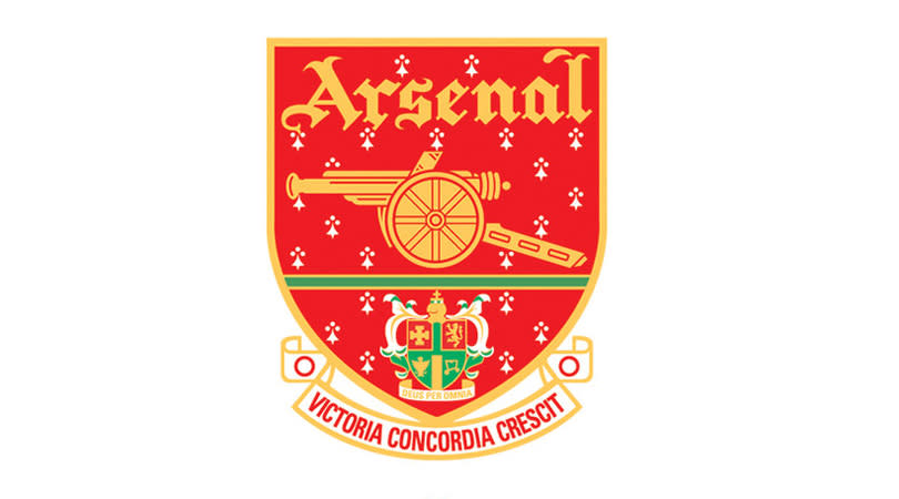


14. Arsenal (1998-2001)

Maybe it’s the nostalgia talking, or memories of Dennis Bergkamp, but this may be the definitive Arsenal crest. The design is busy, no doubt, but that imperfection adds charm, the masses of detail making it feel less sanitised than today’s incarnation.
In the club’s defence, while they did introduce the latest Arsenal crest in 2002 as part of their Highbury-to-Emirates overhaul, a redesign was necessary: they’d tinkered with the previous design so much over the years that they couldn’t copyright it.
READ MORE: Exclusive - Lineker on why Mourinho gets such criticism
READ MORE: Gossip - Hazard to snub new deal, Walcott to leave?
READ MORE: Klopp - Liverpool’s Champions League tie is ‘all or nothing’
Our chosen favourite (1998-2001) was one of five almost identical badges used between 1990 and 2002, and gets our vote only because its creators didn’t feel it was necessary to add ‘The Gunners’ above a picture of a gun.
The new crest has a purpose. This ’90s design, however, has Gothic script, heraldic ermine resembling snow, and most importantly of all, it doesn’t look like a bloody cartoon.
13. Blackpool (1979-1987)

Perhaps appropriately for a club with such diverse nicknames as the Seasiders and the Tangerines, Blackpool have had numerous badges during their history, though sadly neither seasides nor tangerines have featured on any of them. The team’s shirts have been adorned by coats of arms, monograms, no badge at all and, confusingly, a seagull inside a red rose. Pantomime boos at the ready: that one was brought in by Owen Oyston, father of current owner Karl Oyston.
Strangest of all was the… thing that was chosen to represent Blackpool from 1979 to 1987 (and we don’t mean Alan Ball). If you correctly surmised that it depicts Blackpool Tower standing proudly above the waves, you’re brilliant, lying or mad. It looks like Nottingham Forest’s logo crossbred with an arrow to form a poster in an inner-city gym that’s pleading with you to recycle.
Yet we say this image should be part of the club today. It’s confusing, vague and has nothing behind it – what other logo could better represent the current situation at Blackpool FC?
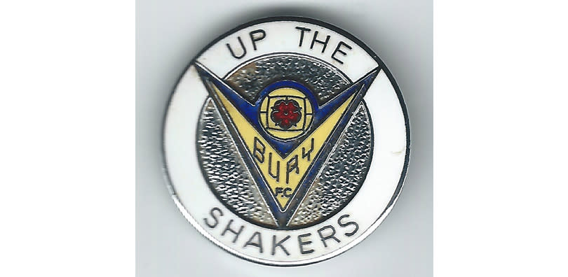
12. Bury (1974-1982)

Bury are one of many Football League clubs to go with a traditional coat of arms. And why not? Because this early version is brilliant, that’s why not.
Despite the red rose, there’s something very Russian about this design – probably the shape and font. You have to applaud the quest for innovation: after seven years with no badge at all adorning their shirts, Bury knocked up a random star for one season and then replaced it with this effort.
11. Wolves (1970-1974)

Here at FFT we love the Wolves crest of today: eye-catching and minimalist yet nonetheless intimidating, if not as downright menacing as it was in the 1980s. Even so, there’s a lingering fondness in this office for the design used in the early ’70s, despite it being very… ‘of its time’, let’s say.
It’s the stylised WW initials that deserved to become iconic, stacked to create a diamond motif that could’ve improved some of the club’s kits over the next few decades. An airborne wolf added dynamism.
Sadly, Wolves chose to turn one crest into two, worn side-by-side on the shirt, and for the second half of the 1970s their lone leaping wolf was replaced by three of the buggers, which, despite George Berry’s best efforts, turned a sleek football club crest into a naff county cricket badge.
10. Chelsea (1905-1952)

Picture the scene. Chelsea have won the 2012 Champions League Final at Bayern Munich’s Allianz Arena following a dramatic penalty shootout. They’ve won the competition for the first time, becoming London’s first champions of Europe.
Despite missing the final, captain John Terry steps onto the podium in full kit, shin pads and all, to lead his team-mates in lifting the trophy. And in this grandiose scene, set to fireworks, confetti and bombastic operatics, the Chelsea shirt he is wearing boasts over Terry’s heart a simple club crest. This crest. The crest of European champions.
Yes please.
9. Cambridge United (1974-75, 1975-77)

Forgive us for repeating what you already know, but there just aren’t enough books on football club crests. Kudos to 1970s-era Cambridge United, then, for embracing the city’s university links and sticking a bloody great encyclopaedia on their club emblem, even if it was hollowed out to make space for a ball. Tch, students.
Such bookishness didn’t catch on, however: the crest was rejigged after one year and replaced after three, despite it coinciding with Ron Atkinson – in his first season of Football League management – guiding The U’s to the Fourth Division title in 1977. He’d later take Brendon Batson, Cambridge’s buccaneering, pioneering skipper, with him to West Brom.
8. Aldershot Town (1992-2004)

Aldershot Town were formed out of the ashes of Aldershot FC in 1992, before phoenix clubs became de rigueur, so it was only right and proper that their emblem focuses on the mythical bird rising from the flames.
This badge was reimagined in 2004 when the club turned fully pro, its brash colouring replaced by a muted yet ornate style. We find the original more arresting, though, however cartoonish. It’s good to see the club’s nickname on there, anyway, and not just because it opens the door for a ‘Shots fired’ pun.
7. Watford (1968-1971, 1972-1974)

Watford’s very nice, simplistic ’70s design may have come as inspiration for Brentford’s new crest, although as FFT is always saying, bees aren’t hornets. This was the first time Watford had incorporated their Hornets nickname into a badge, and the result was so beautiful that they brought it back (with slightly amended lettering) after 1971/72’s year of separation. Elton John and Rod Stewart approve.
There’s a sad postscript, however. Watford replaced this fine aesthetic with a ridiculous cartoon hornet, which has to be seen to be believed, and now they have a ‘hart’ (as in Hertfordshire) that more closely resembles a moose.
6. Bristol City (1976-1983, 1986-1994)

Would you just take a look at this robin? We’re not saying that Angry Birds was stolen as a concept from Bristol City, but where’s their film tie-in? And if flipping the bird wasn’t enough to make this a classic club crest, it also features Bristol’s gorgeous Clifton Suspension Bridge.
The design led City proudly into the ’80s, before being put in mothballs for a few years. Although it was reintroduced in 1986, the iconography looked less impressive without a shield behind it, while the raging robin had mellowed with age.
But speaking of Robins...
5. Swindon Town (1991-2007)

Maybe we’re overly fond of 1990s designs, but in FFT’s mind, this is still Swindon Town’s badge. Rumours that the Robins returned to a traditional club crest 10 years ago are #fakenews.
Yes, it could be the logo of a leisure centre or off-brand squash racquet. But it is simplistic, dynamic and terrific, and if you disagree, tell that to Glenn Hoddle and his tiny shorts.
4. Leicester City (1983-1992)

Leicester’s flowery effort of today has existed in one guise or another since the beginning of football in 1992, but in the mythical BS years (Before Sky), the East Midlands outfit experimented like The Doors in a drugstore. A few dire designs were produced over the years before the club landed on this effort in 1983.
‘The walking fox’ tends to split opinion, with some people loving the unusual design and other people being wrong. It’s certainly far more eye-catching than the dog-in-a-ruff badge that Leicester’s players now wear, and for such a basic design it’s very evocative, outlining an urban fox glancing your way as you stumble towards the side of a desolate road to await the night bus home to your cigarette-burned memories of her. She just needed some space, she said. Now the bed is so cold. Next bus: 34 mins.
3. Newcastle United, 1983-1988

“Carl! Turn off Thriller and put down that skateboard – it’s 1983 and we’ve got our first commission.”
“Gnarly. Why did you say what year it is?”
“Look, the important thing is that Newcastle United want a new club crest.”
“Radical. I have this bodacious new design that I could turn into a Newcastle badge. I’ll just stick a magpie on it.”
“Nice. But Carl, these are the letters N, U, F and another N. They aren’t called Newcastle United Football Nlub.”
“So? It looks righteous. And as long as Gazza wears it, nobody will care.”
“What’s a Gazza?”
2. Portsmouth (1980-1989)

This isn’t Portsmouth’s traditional club crest – the current design is closest to how they started out – and it isn’t popular among Pompey fans, either, but it is decidedly badass. Look, Micky Quinn agrees.
Breaking up 100 years of moon and star motif, borrowed from the city’s centuries-old emblem, was this radical departure, created to stop thieving blackguards from eating into the club’s profits with their own ripped-off merchandise. A sword and anchor represented the port city’s links with the army and navy, with an alternate version of the badge including the moon and star in place of a football. Well, the ball being pierced by a sword did seem unhelpful.
Led by former Disney CEO Michael Eisner, Portsmouth are redesigning their badge again now. Sadly – for FFT, at least – the odd couple of sword and anchor will not be making a return.
1. Sheffield Wednesday (1973-1984, 1984-1995, 1999-2016)

Now this is a badge. With no offence meant towards the blinking mascara monster that the club adopted last year in tribute to the 1950s logo, the long-running motif of a perched owl turning to camera is deservedly the most iconic incarnation of Sheffield Wednesday’s crest.
Our No.1 ticks all of the nostalgia boxes, of course, but it is the artistry behind the stylised drawing that provokes this emotional reaction in football fans of a certain age. Rounded yet angular, modern yet timeless, the design is instantly recognisable and truly hard to dislike. We hope the local art student who created it still gets royalties.
The official badge existed in three forms. The second incarnation took on the club’s initials as well as a psychedelic hue, and the third – introduced on the eve of the new millennium after a four-year return to a more traditional look – threw in a shield and date of foundation to go with the SWFC and owl image.
Less is more, we say. Our firm favourite is the version used by Sheffield Wednesday from the mid-1970s to the mid-1980s: gone, but not forgotten.
Click here to see the horrific badges we never want to see return
Ten awful badges
Leeds United (1973-1980)

Three badges in this time, all awful, like a government GCSE learning programme. Absolute definition of trying to polish a turd. It was wrong. Don’t try to finesse it. Get rid of it. Like in defence.
Huddersfield Town (1969-1970)

Huddersfield’s Terriers nickname only came about in the ’60s. So, in 1969 we got this amorphous blob. Can barely even make out what it is. It got better, but when you start with the dogs from John Carpenter’s The Thing, it can’t exactly get worse.
Bournemouth (1981-1983)

You might think the Henna ad of a crest is new, but it’s been around since 1974. For two years, though, they adopted something more befitting of club nickname the Cherries, before quickly realising why that was a terrible idea. We want to see it again, though, because until Louis van Gaal buys a club, we’re not going to see a football team proudly display a pair of bollocks on their badge.
Hull City (all of them)

They are so bad at drawing tigers. Always.
Mansfield Town (1961-65)

This is an alien with antlers.
Swansea City (1973-75)

Controversial dragon badge, 40 years before Cardiff City did it.
Berwick Rangers (old)

This is why you make the bear and tree different colours – so it doesn’t look like a genetics experiment gone wrong.
Burton Albion (1993-94)

Two short-lived badges in 18 months (January 1993, then the 1993/94 season), both showing a brewer serving up as if it’s a beer festival advert. Somehow they’re still better than the shocker they have now.
Hibs (1989-2000)

We actually like this logo, but only because we think we’ve drunk a beer with it on before.
Fulham (1931-1946)

An actual cottage. This was their first badge. Why does the house have cracks in it?
Now read...
FFT INVESTIGATES Whatever happened to goalmouth scrambles?
INSIDE STORY Why Kaka didn't join Manchester City in 2009: "The situation messed me up..."

