
 Yahoo Sport


Ranked! The 21 worst club badges in world football


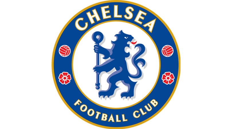


21. Chelsea
Unlike the roaring beast that dominated the Blues’ badge from 1986 to 2005, this incarnation of the Chelsea lion is far from intimidating.
Numerous changes were made in the revamp of an older crest, so there’s no excuse for a supposedly ferocious creature merely looking miffed that an opposition striker has beaten its offside trap. Or is that what Chelsea were going for?
Alternatively, the king of the jungle may have been distracted in the middle of doing something important. “And so, I present to you the keys of the city, for serv – oh hi, Bill, didn’t see you there.”
20. Benevento Calcio
At the time of writing, Benevento are (comfortably) bottom of Serie A with two wins from 21 matches.
A team facing Juventus should not have this crest. Has that witch even made it off the ground? What sort of crest makes you ask that question?
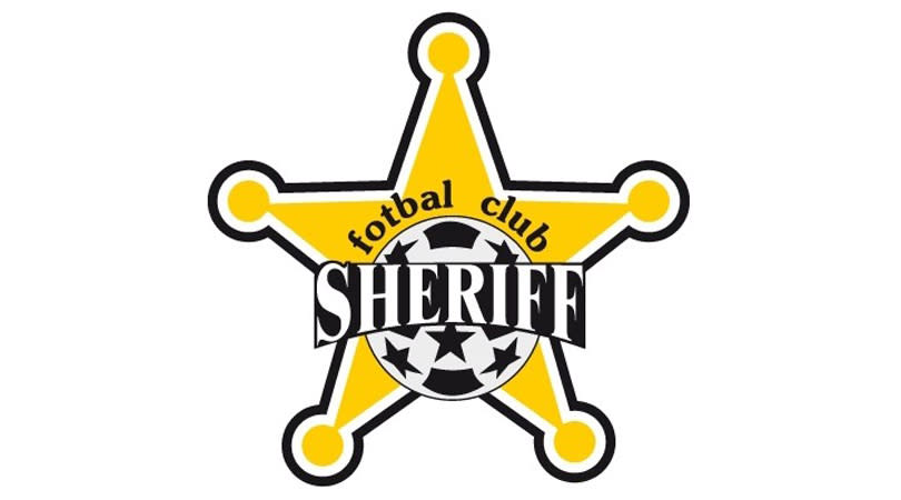
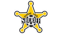
19. FC Sheriff Tiraspol
Serial Moldovan championship winners and regular Europa League botherers, Sheriff were founded by a company called Sheriff, play at the Sheriff Stadium and have a sheriff’s badge as their… well, badge. Clearly someone’s a big John Wayne fan. Still, putting a star above a star, which features a football made of stars, might just be overkill.
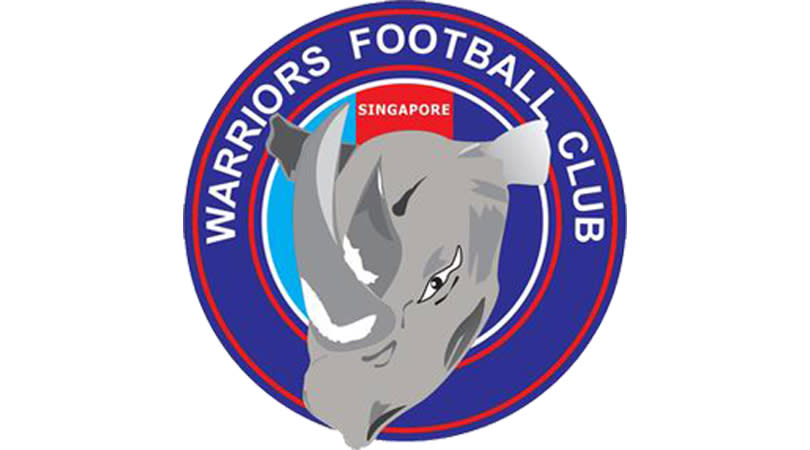
18. Warriors
Warriors were called Singapore Armed Forces FC until 2013. They have never been nicknamed the Rhinos. But when the S.League (yes, that is how they punctuate it) insisted all mascots have to be animals, rejecting Warriors’ warrior, the club opted for a rhino instead, despite nobody being able to draw one. Their attempt is so naff, it’s almost good. The key word there is ‘almost’.
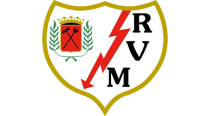
17. Rayo Vallecano
While FFT loves the fantastically left-wing Madrid side, we think it’s a step too far to use the club crest to lay into capitalism by displaying a stock market crash.
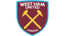
16. West Ham United
Having ‘TIW’ adorning the crossed hammers is a nice touch, referring to club forerunners Thames Iron Works. However, the attempt to market the club globally upon their move to Stratford – and removal of Boleyn Castle from the badge – is so cynical, so blatant, that it feels as if LONDON should be followed by the word (HONEST).
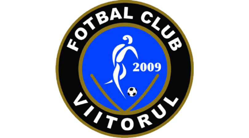
15. Viitorul Constanta
He’s totally air-kicked this, right? Maybe the Romanian title chasers are trying to lure opponents into a false sense of security.
14. Alloa Athletic
Lordy, what a logo. The Wasps were relegated from the Scottish Championship in 2015/16 but fared better in the third tier last time out, finishing second. We put that down to the stupendous amount of steroids they’ve been pumping into their mascot.
Also: are those sweatbands he’s wearing? Do wasps sweat?
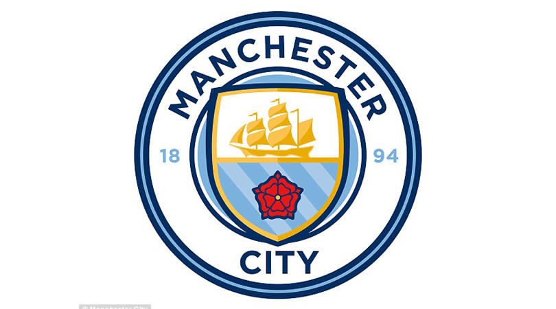
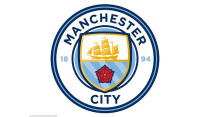
13. Manchester City
In December 2015, following protracted disgruntlement among some sections of the fanbase, Manchester City did away with the giant eagle that had adorned their crest since 1997. The new design was meant to be unveiled on Boxing Day, only for the Intellectual Property Office to spoil the surprise by putting it on their website before Christmas.
In any case, it was goodbye to the eagle, the three stars, the Latin motto ‘Superbia in Proelia’ and the less Latin ‘FC’, everyone having now accepted that Manchester City are a football club. And City supporters rejoiced, as the emblem returned to its humble origins as a club badge on Pro Evolution Soccer.
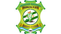
12. Limon FC
Costa Rica are actually quite good at football, so their Primera Division is worthy of better club badges than this. At least the humanoid tornado sees the funny side… or it’s sucking on a Limon. We can’t tell.
Besides, we’re more concerned with why its left arm is so much beefier than its right – and, come to that, why a tornado has arms. After all, it’s still able to kick a football using, like Neil Ruddock, the power of wind. And how does its crown stay on? So many questions.
11. Genoa
The facial expression says it all.
10. Universidad de Chile
The chuncho, or Austral pygmy owl, is apparently meant to represent wisdom, knowledge and spiritual harmony, but none of those things are evident in La U’s drawing of it. What’s meant to be an owl looks more like a skull perched atop the uniform of an American jock.
Over time, the owl/skull/thing’s expression has softened from anger to bewilderment, which is the path all of us must take eventually.
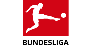
9, 8, 7, 6. Hamburg, Nuremberg, Wolfsburg & Werder Bremen
Put some bloody effort in, Germany, for God’s sake. It’s as if the Bundesliga realised the day before its first season began that there was no way to identify its members, and every club had to come up with a logo overnight. Matches between Werder and Wolfsburg resemble a clash between rival supermarket chains. They’re not alone, either.
Hamburg’s crest is assuredly the worst, although we will give them a pass because their defining pattern allows for some excellent team photos, ruined only by the prominence of their dopey mascot. You can’t do that with an elaborate coat of arms.
CLASS: Hamburg's 2016/17 team photo, including players from the U11's right up to the senior team. pic.twitter.com/Rfwvo3VrNw
— BBC Sporf (@BBCSporf) September 17, 2016
5. Wycombe Wanderers
“Gerald, what the hell have you been feeding the mascot?”
4. AS Marsa
The Tunisian top-flight outfit have a badge straight out of a religious children’s book. And, as charity-shop wisdom dictates, it’s easier for a camel to get through the eye of a needle than into a football strip.
The creature itself seems to know this, looking at its lurid kit as if to say, “Does my hump look big in this?” That’s the least of its worries: its right foreleg is twice as long as its left and has at least three kneecaps.
No, no, this isn’t right at all. Someone in the north of Africa is genetically modifying camel DNA.
3. RB Leipzig
The universally loathed Leipzig are bankrolled by Red Bull, energy drinks manufacturer and patron saint of lorry-driving students. You may have noticed from their historic club crest. By the way, their name is ‘RasenBallsport Leipzig’, meaning Lawn Ball Sports Leipzig, which is of course perfectly natural and just coincidentally has the same initials as Red Bull.
But German football rules forbid advertisement on their badge. So instead, not-Red Bull Leipzig have two red bulls charging into a golden orb, in an image that is in absolutely no way reminiscent of Red Bull’s logo.
2. Catania
It feels churlish to criticise incorrect scale in a club’s badge, given their artistic nature. Even so, Catania’s crest is just bizarre.
Why is that leather ball so ludicrously large? Shouldn’t the blue and red shield, emblazoned with the club name, be the crest’s main feature? Why is that elephant trying to hide behind said shield? If Babar’s doing something naughty, football fans have a right to know.
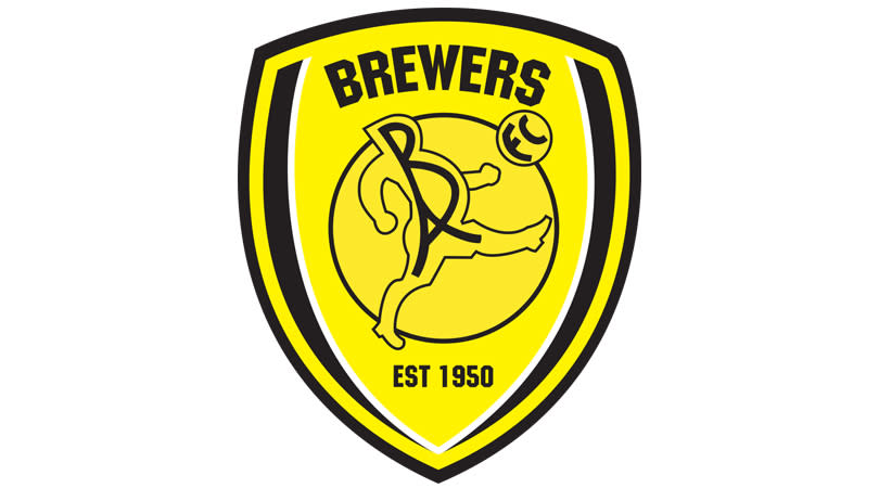
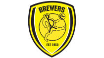
1. Burton Albion
Most clubs seek to finesse their image when they reach new heights. Not Burton. The Brewers are higher up the ladder than they’ve ever been before, but they refuse to drop their pub team of a crest.
Just look at it. Gaze upon this exquisite monstrosity. The image Burton Albion have chosen to represent themselves to the world is an oddly proportioned chubber failing to do keepy-uppies in his dance shoes. Perhaps this is a warning about the dangers of brewers getting high on their own supply.
Nothing about this badge is right, to the point that all the wrong elements even clash with each other. Leading with ‘BREWERS’, and in that font, brings to mind an American football team, while the bloke beneath it decidedly does not. As for the ‘BA’ logo, we can only assume someone started with an idea and forgot what it was, and halfway through sketching had a shot at the Eiffel Tower instead. Oh bugger, forgot the ‘FC’. It’s OK, I’ll put it in the ball.
That all being said, we still love Burton Albion’s crest. Nobody wants every club badge to look like Hamburg’s.
