
 Yahoo Sport


#AgainstModernFootball - redesigned club badges

If you just so much as glanced as your Twitter timeline on Monday evening you’ll have been faced with an image. It’s an image of two white lines set against a black backdrop, in the style of some double yellow lines you’d find on the roadside curving round a corner. It could be binary. It could be a modern interpretation of the Atari logo. But, no, this was neither. It was Juventus’ new club badge.
Not since West Ham tried to brand themselves as London’s team by cynically inserting the city name into their badge, or since the Football League decided to rebrand itself as an English Defence League shoot-off, had a footballing rebrand been so universally panned. Not even Tom ‘The Brand’ Cleverley took this much flak.
But this wasn’t just a new badge for the Turin club. This was emblematic of a “way of life,” and “defines a sense of belonging” as they put it. It is supposedly illustrative of how Juventus are more than just a football team. Drake wears their kits, after all. He also has a signed Daniel Sturridge shirt, but he refuses to wear it because Liverpool’s badge isn’t cool enough. It just doesn’t say anything about the club’s way of life.
[JUVENTUS UNVEIL ODD NEW CLUB LOGO]
[THE WORST BADGES IN THE HISTORY OF FOOTBALL]
Of course, branding isn’t always an exercise in creating something likeable. It’s about coming up with something instantly recognisable, and Juventus’ new badge certainly is that. In a lineup of football club badges Juventus’ effort to illustrate too Js spooning does indeed stand out. Alessandro Del Piero didn’t die for this.
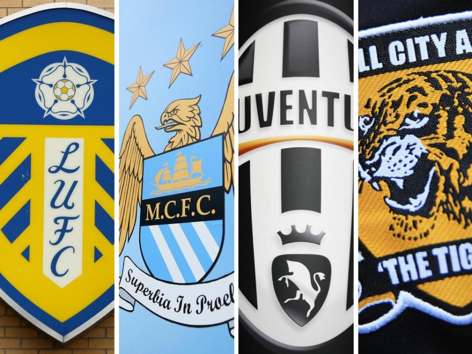
Club rebrands are a difficult business. Everton tried it a couple years ago, coming up with a simplified version of what they already had, dropping the club’s latin motto. Supporters revolted, though, and the new badge only last a season before they switched back to the old one.
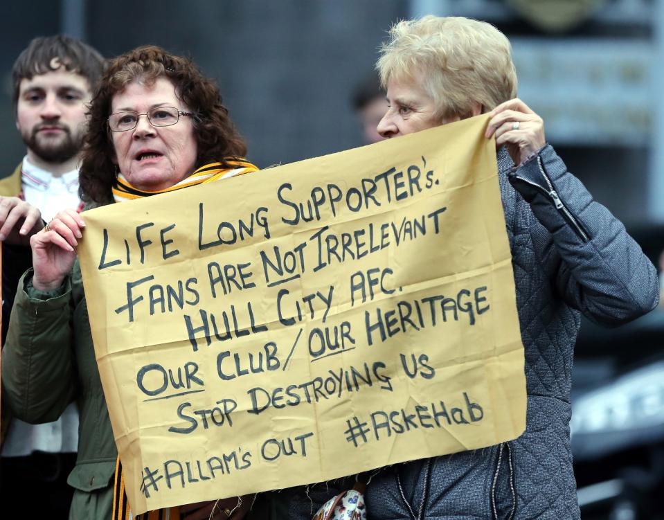
Then there was Assem Allam’s attempt to rename Hull City, designing a badge that featured ‘The Tigers’ more prominently than anything else. Vincent Tan demanded a complete overhaul of Cardiff City’s identity as a club, changing the Bluebirds’ badge from blue to red. The, err, Redbirds?
Football has lost so many timeless crests over the years. Take Arsenal for instance, whose badge was synonymous with the Gunners. The gothic font the word ‘Arsenal’ was written in communicated the identity and personality of the club better than anything designed on an iMac in any Shoreditch studio could. All this was ditched, though, in favour of something that wouldn’t look out of place in a Pro Evo game. It might as well have ‘North London Reds’ scrawled across the top of it.
Aston Villa altered their badge over the summer. Although the changes weren’t exactly wholesale, with only the word ‘Prepared’ removed from the crest. The redesign cost the club £2 million. They could have got half an Alan Hutton for that. Or a full Ritchie de Laet. Money well spent? They probably could have saved a fair bit just by using the panelling tool in Microsoft Word.
Some clubs have fared a little better in redesigning their badge. Manchester City’s new crest, for instance, was met with supporter positivity, even if it does look a little like a Blue Peter badge. Spurs’ crest, which has been on their shirts since 2006, is far more iconic than anything they had for the 30 years before that. The change in badge at Chelsea in 2005 was also well received, with Roman Abramovich restoring the lion rampant in a rare case of ‘egotistical foreign owner respecting club’s history.’
All this is the product of modern football. No longer is it enough to simply have a badge that fans can identify with. Now football clubs need to be brands and so they put more thought into their image than a high street chain. If Woolworths had made this much of an effort into their branding they might still be around, fuelling Britain on pick n’ mix.
But this neglects the inherent connection fans have with their team. To change their image is to change a part of their identity as supporters. Any rebrand must be in collaboration with them, because without them the whole thing is a bust. Juventus need more than just Drake to buy their shirts.
