
 Yahoo Sport


Ranked! The 20 best Premier League kits of the 90s


Get your hands on the latest issue of FourFourTwo magazine - available in print, or alternatively on iPad and iPhone – now
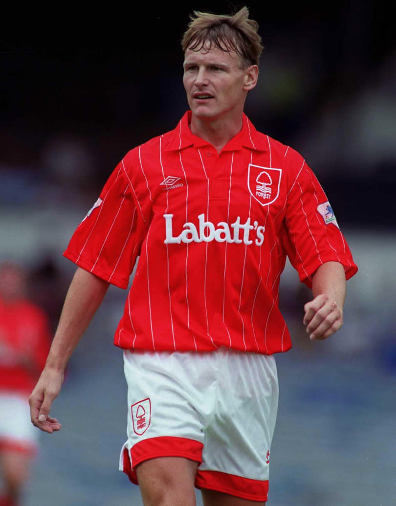
20. Nottingham Forest, home (1992/93)

This kit should bring back bad memories for Forest fans: relegation, the final year of Brian Clough, Robert Rosario wearing it. But the design is so pleasing that all of it almost disappears. The elegant pinstripes offset the presence of the weak Canadian lager advertised over it.
READ MORE: Ross Barkley denied chance to make Chelsea debut
READ MORE: Gossip - £20m Carroll, Aubameyang agrees Arsenal deal, Mkhitaryan wants pay rise
READ MORE: 15 Premier League stars signed for £1m or less
19. Wimbledon, home/away (1992/93)

This sort of makes it in on a technicality, because it purely qualifies on the basis that Wimbledon didn’t carry a sponsor on their shirt that season. This isn’t a comment on the corporate greed of modern football, more one on clean kit designs: football shirts always, always, always look better without a sponsor.
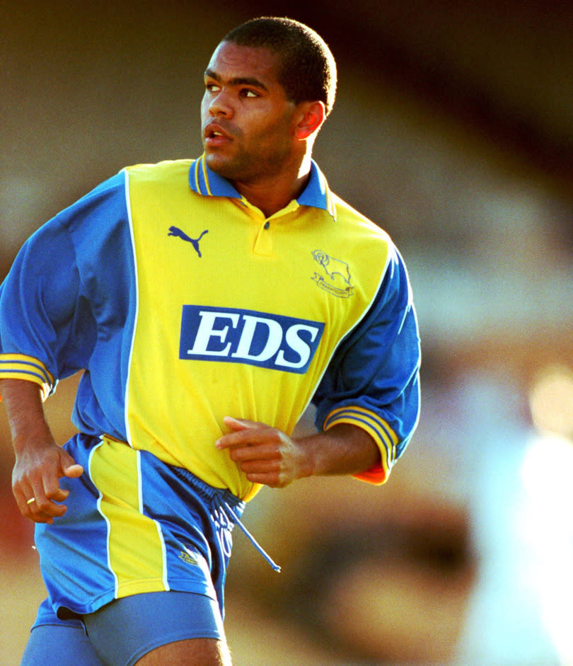
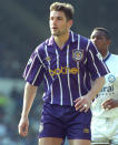
18. Derby, away (1999/2000)

Derby’s Premier League-era kits are, almost without exception, terrible. Maybe it’s because they were often made by Puma, who didn’t really hit their stride until that run of shirts in the early/mid-2000s which basically went see-through whenever anyone sweated in them. This one, however, is rather tidy. An always-winning combo of blue and yellow, nice and clean, plus Georgi Kinkladze wore it. What’s not to like?
17. Aston Villa, away (1994/95)

This one gets in perhaps not because it’s an especially nice kit, but because it’s so quintessentially ’90s. It looks just like a collarless shirt you could imagine Lee Sharpe or Ryan Giggs putting on to go down the disco circa 1993. Green, black, thick lines – it’s horrible really, but if ever an item of sportswear summed up a decade…
16. Manchester City away (1993/94)

The high point to City’s away kits was their black and red checked number circa 1987 (look at this piping!) but they never quite nailed the retro away jersey in the ’90s. This one though, while admittedly looking a little like something you’d find in the River Island sale, is a pleasing combination of simple (straight up and down pinstripes) and unusual (who has a purple kit?), which makes it as memorable as their team back then wasn’t.
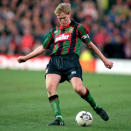
15. Leeds, home (1996-98)

Sometimes, as we all know, less is more. The plain kit can be a bit of a cop-out, but it can also be a beautiful piece of clean design. As a team who have worn all white since the 1960s, Leeds have enjoyed a few of these, but of their ’90s strips this one stands out. The sponsor’s logo is arguably a bit too high, but it makes up for it by being relatively small and unobtrusive.
14. Oldham, away (1992/93)

Quick: tell us five things about Oldham Athletic in the Premier League. Ian Marshall… Joe Royle… erm... Boundary Park is really cold… erm… that’s about it. Shame that more people don’t remember this shirt, because it’s lovely: a sort of reverse Ajax number which, appropriately enough, is how you might describe their team too.
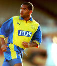
13. Newcastle, home (1999/2000)

Actually, the one from 1992/93 was nicer, with its big blue Newcy Brown star in the middle, but this one makes the list because it was a return to form, coming after that awful shirt they had with a big shield on the back (the one Temuri Ketsbaia ripped off to kick seven bells out of an innocent advertising board). It’s also a lesson in an art which shouldn’t be complicated but plenty make a mess of: getting the proportions of stripes right.
12. Blackburn, away (1994/95)

Nice kits and success don’t always go hand-in-hand (Manchester United’s home shirt in 1999 was, for example, rubbish), but presumably Blackburn fans will have been extra delighted that their league title win was achieved in such terrific togs.
11. Chelsea, away (1992/93)

Pinstripes. Pinstripes always look smart on a football shirt. Do more pinstripes, kit designers. Pinstripes. More pinstripes please.
10. Leeds, away (1999/2000)

This one is difficult to explain why it’s quite so nice. Perhaps it’s the shade of blue. Perhaps it’s the placement of the single stripe across the chest. Perhaps it’s the knowledge that this was a pretty facade to the impending financial crisis at Elland Road. Whatever the reason… it’s just a nice shirt, innit?
9. Coventry, away (1998/99)

This looks like a last-minute job: in the last week of July, 1998, someone at the Le Coq Sportif (by the way: extra points for Le Coq Sportif) factory suddenly sat bolt upright and screamed: “S***! THE COVENTRY AWAY KIT!” then ran around like the McAllisters when they realise they’re late in Home Alone. How else do you explain pairing yellow with purple and a dash of red? But, perhaps through sheer luck, perhaps because they’re Le Coq Sportif, somehow it works.
8. Aston Villa, away (1992/93)

Umbro were absolute sods for a template in the ’90s, two or three teams often looking more or less identical but with changed colours. This was one of the better ones, though, clean and white with blocks of colour on each arm that looked a bit like Tetris pieces. Not quite as good as their Hummel outfits of the late ’80s, but splendid anyway.
7. Sheffield United away (1992/93)

Speaking of those Umbro templates, here’s one that did the rounds of the Premier League in the early ’90s, but the colours on this Sheffield United top – bright yellow, red and black trim – really made it pop. This, and an even brighter yellow one a couple of years earlier, meant Blades away ends often looked like congregations of match day stewards.
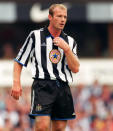
6. Newcastle, away (1995/96)

Question: which is the only sponsor’s logo to actively enhance a shirt? Answer: Newcastle Brown Ale. This would be a pretty sweet kit anyway, employing the underused hoops formation, paired with a tasteful dark blue and maroon colour scheme, along with that collar Miles off of This Life always seemed to have on his shirts. Very ’90s.
5. Coventry, away (1996/97)

Why don’t more people do chessboard kits? Everyone loves Croatia’s, they’re a bit different and stand out, plus they look absolutely sensational. The Coventry away kit everyone remembers is that brown one from the ’80s, but this one is better and has the benefit of not making every player look like they’ve violently soiled themselves.
4. Liverpool, home (1992/93)

The ’90s was, of course, the era of the baggy kit, when manufacturers cut loose with the longer shorts and, giddy with the possibilities opened up by using extra material, started producing shirts that looked like each player was wearing their older brother’s togs. This effort did have a billowy element, and signalled the early years of Liverpool being a bit rubbish, but the clean lines and adidas stripes are a sight to behold.
3. Manchester United, away (1992-94)

Football and advertising started to get themselves together properly in the ’90s: that may or may not be a good thing, but the campaign Umbro ran to go with their Newton Heath-inspired half-and-half yellow and green strip was certainly memorable. Look at how proud Mark Hughes and Gary Pallister are with their moustaches!
2. Arsenal away (1992/93)

Did you really watch football in the ’90s if your dad didn’t say at some point: “That Arsenal kit looks like cat sick!”? Well, your dad was wrong: this was a belter, perhaps looking a little more like television interference than is ideal, but providing an iconic adidas pattern that lives on today in hipster corners of east London.
1. West Ham, away (1993-95)

Retro kit designs can be a bit hit and miss: a pleasing nod to the past, or a lazy neglect of ideas? Could be both, but sometimes they come up lovely, like this one by West Ham, based on their away kits of the 1960s. Sure, Ian Bishop, Trevor Morley and Tim Breacker weren’t quite Hurst, Peters and Moore, but a kit design can only do so much. Still… what a kit design.
