
 Yahoo Sport


Ranked! The 20 worst Premier League shirts EVER


20. Manchester United, 1992-94 (third)
United fans have used green and gold to great effect over recent years as part of their protests over the club’s ownership, but back in ’92 the club themselves happily embraced the colours to celebrate the 100-year-old Newton Heath design.
While iconic – and it also led to a superb mock poster in which the entire squad had Victorian moustaches Photoshopped on – the shirt was, alas, pretty nasty, and mainly serves to remind you why they switched to red.

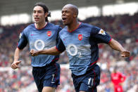
19. Arsenal, 2002/03 (away)
Nike hadn’t gone quite as haywire as other manufacturers during the previous decade when it came to experimental kit designs, largely keeping things simple. Yet this gradient-crazed piece of computer modelling, while decent enough within itself, always looked more like an extended billboard for sponsors O2, rather than a football shirt.
READ MORE: Gossip - Barca target £44m Bellerin, Bayern enter race for Lukaku
READ MORE: Forget Messi - Ronaldo is the world’s best player BY FAR

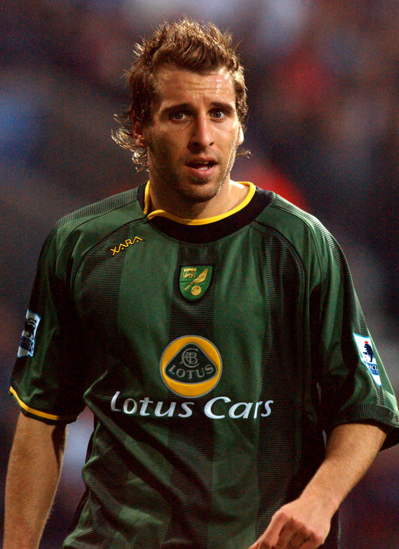
18. Norwich, 2004/05 (away)
While they were never going to top The Bird Poo Kit (on its way to your eyes very soon) in terms of sheer hideousness, oddball manufacturers Xara had a good go with this asymmetric curiosity. Although, admittedly, the Lotus badge in the middle somehow looks pretty right.
READ MORE: 'Buying Ozil was an insult to Wilshere' - Adams criticises Wenger's transfer approach

17. Chelsea, 2007/08 (away)
If Manchester United couldn’t see each other in their notorious grey jerseys, then there were no such issues for Jose Mourinho’s (and from September, Avram Grant’s) men in this season. With neon tops visible from space, the only issue here was working out who was a player and who was a fan, steward or errant lollypop lady.

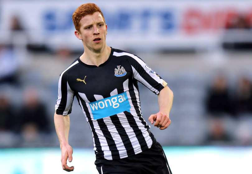
16. Newcastle, 2014/15 (home)
We’re no Pierre Cardin, but any Newcastle home shirt is surely easy to get right: simply bang a badge on the hallowed black and white stripes, and you’re almost done.
This madness, alas, is polluted by an unnecessarily vast black chest patch, and debased by the presence of revolting payday loan swines Wonga as a sponsor. One to forget.

15. Tottenham, 2009/10 (home)
Spurs kits tend to be pretty solid – the ol’ Lilywhite and black are a strong aesthetic pairing – but unnecessary yellow flanks and chest swipes pooped this shirt’s party, while MANSION DOT COM CASINO & POKER was also a bit of a mouthful. Disappointing.

14. Everton, 2010/11 (away)
There’s nowt wrong with a nice bit of pink on a football shirt – Juventus have done it stylishly, and Palermo rock the electric shade week in, week out. But the Toffees’ attempt was a rotting salmon, making Diniyar Bilyaletdinov, Phil Jagielka & Co. look like 1980s mismatched socks.

11. Manchester City, 1994/95 (away)
Umbro produced some great tops for City around this era, and this red-and-white striped attempt could have joined the pantheon of acceptability (although many supporters understandably objected to the former colour).
So why did the design team add the weird grey armpit-to-shoulder flanks in? It gave the look of a garment that had been patched together by Peter Beagrie’s mum after suffering heavy wear and tear. No wonder they finished 17th.

12. Arsenal, 1991-93 (away)
A brown acid bad trip, psychedelic meltdown and sweaty swine flu nightmare of a design: perfect for a Grateful Dead poster, but not suitable in any form to clad Steve Bould. Side effects of wearing the ‘Bruised Banana’ included delirium, epileptic episodes and losing 2-1 at Highfield Road.

11. Manchester United, 1992/93 (away)
A kit that even smouldering dreamboat Eric Cantona looked a dick in, the whacking great club crest and peculiar black stripes was further proof that just because you can suddenly design such things doesn’t mean you should.

10. Coventry, 1992-94 (home)
What is it about the early 1990s and smudgy shirts? Every kit designer with a fancy new Apple Macintosh suddenly started to go wild for splodges and flecks, resulting in this monstrosity which art critic Brian Sewell would probably have called the work of an ignorant, inarticulate, talentless, loutish, self-regarding exhibitionist, had he not been too busy slagging off Tracy Emin.

9. Middlesbrough, 1996/97 (away)
Nineties Boro were a lot of fun for several reasons: the Riverside, Fabrizio Ravanelli, Juninho, promotion, relegation, re-promotion and cup finals. They also sported some very fine red shirts during the period – but this errea effort was a mis-step, from the walloping BORO scrawled over the arm to the curious cross made out of your nan’s decaying curtains.

8. Blackburn, 1996/97 (away)
Oh Lordy. While Blackburn’s home kits have almost always been models of tasteful understatement, this away effort was genuinely upsetting. Its sprinkled black club crest collage, down one side and along a sleeve, made Colin Hendry and friends look like they’d succumbed to some sort of jaundicing tropical disease.

7. Aston Villa, 1993-95 (away)
There's always a lack of dignity in a shirt sponsored by a yoghurt manufacturer: the bacterial fermentation of milk may be delicious, but it lacks the steely gravitas most teams hope that their hallowed shirt might exude. Green, black and red stripes add an extra layer of non-delicious fruit corner frivolity.

6. Norwich, 1992-94 (home)
Unfortunately nicknamed the ‘bird poo kit’, the design resembled a canvass that even squirt maniac Jackson Pollock might have binned for being too splattery. A shame, then, that this revulsion was worn during perhaps Norwich’s finest ever period on the pitch, as they finished third and then took apart Bayern Munich in Europe.
Perhaps there’s some kind of correlation, and they should bring a similar horror show back? To the abattoir!

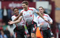
5. Liverpool, 2013/14 (away)
Brendan Rodgers’ men had a smashing season in 2013/14 – which was lucky, because they looked a right bunch of plums on their travels. The top half of this one was reasonable, with standard enough red-on-white lines, but what was going on in the bottom half? Was it a malfunctioning television? A virus attacking Ceefax? The smouldering wreckage of a Sinclair C5? Moronic and confusing.

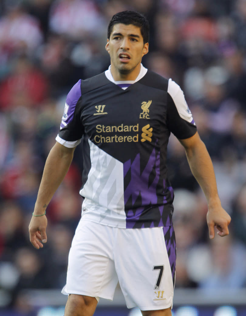
4. Liverpool, 2013/14 (away)
Astonishingly, Liverpool’s white away kit from this term – quite comfortably one of the worst shirts of the Premier League era – wasn’t even the worst away shirt the club had that term.
A root-and-branch internal investigation leading to several sackings must surely have been undertaken at Warrior after this utterly deranged design was allowed to become reality, leaving Luis Suarez resembling a capering medieval jester. Huge shame on everyone involved.

3. Manchester United, 1995/96 (away)
Benchmark wrongness: as the Premier League’s relentless monetisation of everything kicked in, shirt sales suddenly became a vital worldwide revenue stream, and this grey-on-grey number was specifically designed to go nicely with jeans.
The problem? The players claimed they couldn’t see each other during a fixture at The Dell, were 3-0 down at half-time, performed a Mariah Carey-style outfit change, and it was never seen again.

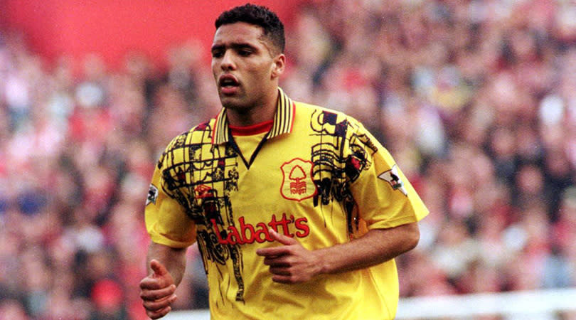
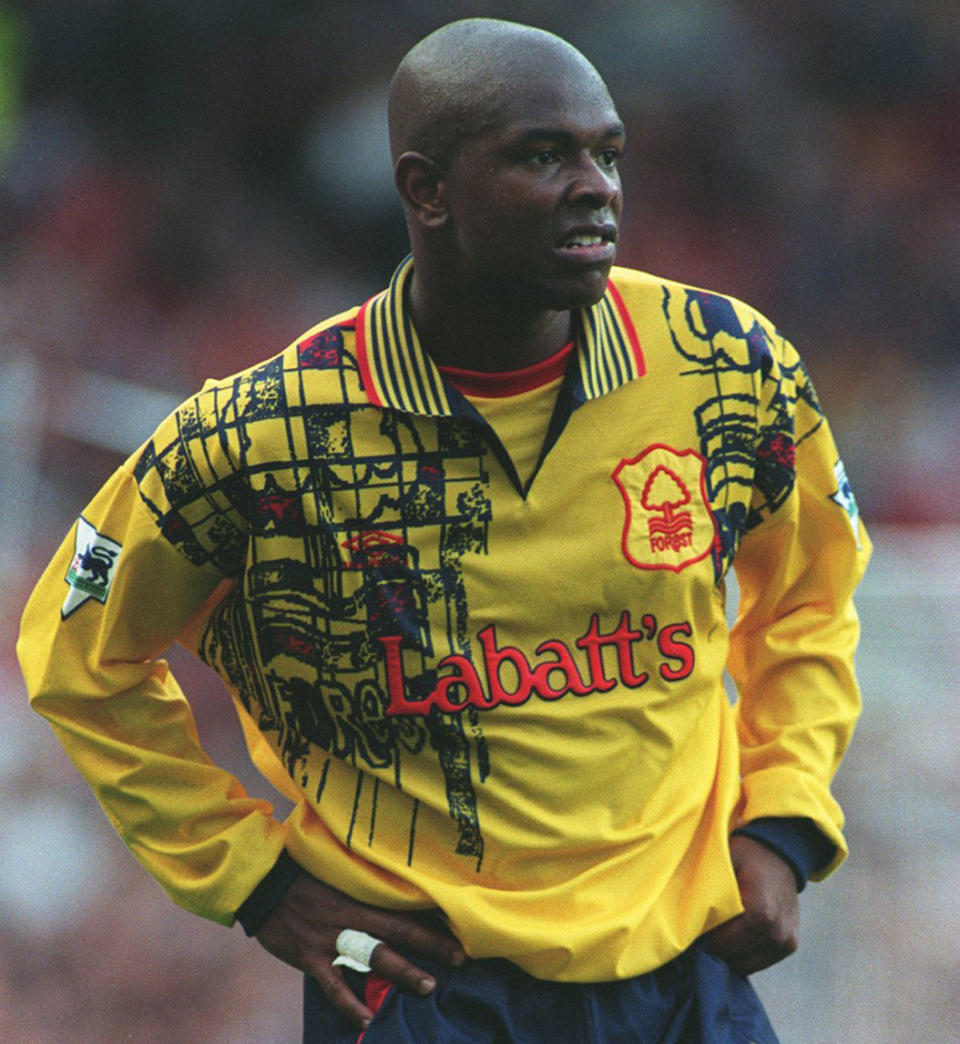
2. Nottingham Forest, 1995-97 (away)
A toddler’s crayon rampage, a dropped pie, an old man’s knee, a malfunctioning bile duct, a crashed magician’s van leading to several fatalities – all spring to mind while gazing upon this vileness, a stoned sixth form design project that should have been strangled at birth. Extraordinary.

1. Chelsea, 1994-96 (away)
Even Ruud Gullit couldn’t pull off the slapdash mishmash of greys, blues and oranges. Abetted by the logo of unpalatable American ‘beer’ makers Coors, the overall result was the Mona Lisa of ropey football kits.

Now read...
