
 Yahoo Sport


Ranked! Every 2017/18 Premier League home kit

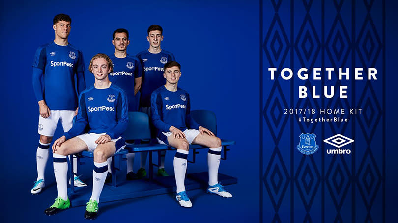


20. Everton
No. No. No. Absolutely not. This looks like someone at Umbro forgot they needed to do a kit for Everton, were reminded the day before it was due so found some training tops from the late ‘90s at the back of a cupboard somewhere. Did we say no already?

19. Burnley
Urgh. Why has someone pebble-dashed the sleeves? The thing about having a shirt that traditionally has different coloured arms to the body is that it provides enough variety to prevent needless messing around. They have needlessly messed around.
READ MORE: Man United starting to get it right in the transfer market
READ MORE: The stars Chelsea have let slip through their fingers
READ MORE: Club legends who became managers and were hits or misses

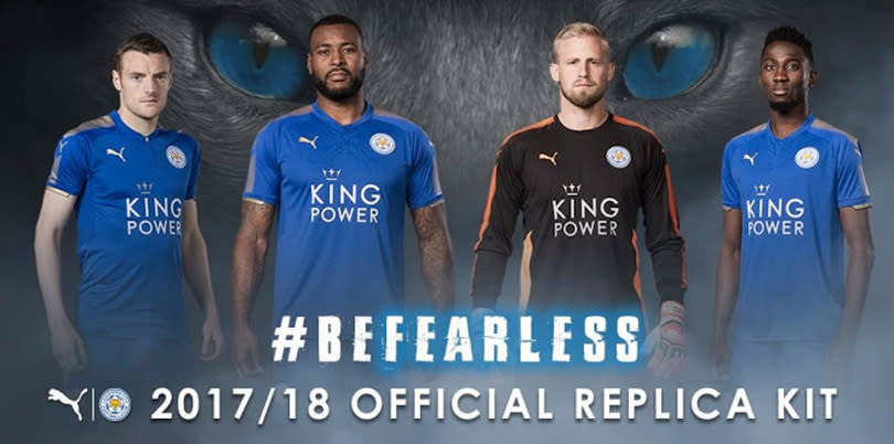
18. Leicester
Why have Leicester suddenly decided they need shiny gold bits on their shirt? You could just about excuse it while they were reigning champions, but now it just looks like a cabaret outfit designed by a five-year-old with a dressing-up box.

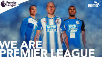
17. Huddersfield
Hmmm. Presumably they won't care what they're wearing, as long as they're doing it in the Premier League, but this looks like it's part shirt, part epilepsy-inducer. Puma's apparent hatred of straight, clean lines in favour of something that makes you feel drunk, should not be encouraged.

16. Swansea
It's a bit difficult to know what to say about this shirt: as plain as plain can be without looking especially nice. You do still think Joma shouldn't be manufacturing anything other than mid-range goalkeeping gloves advertised in the back of FourFourTwo, really.

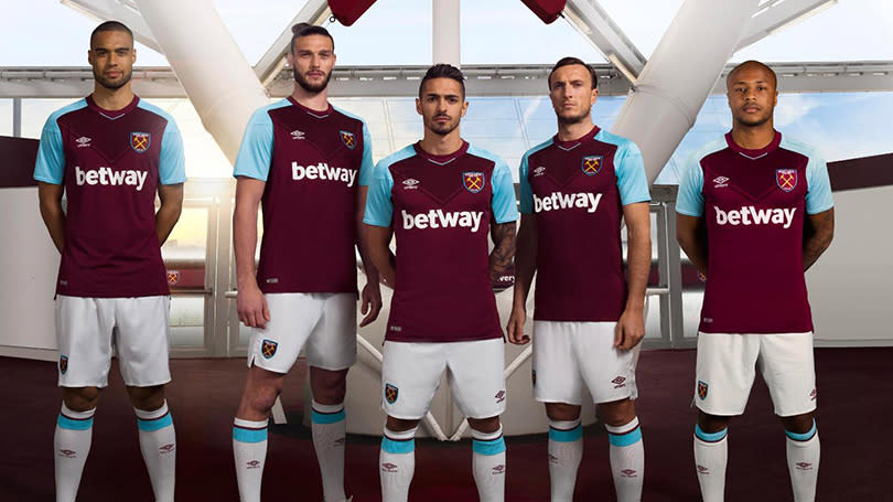
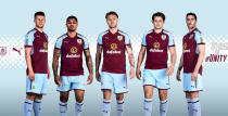
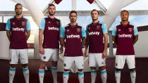
15. West Ham
Not really sure about the two-tone V-shape in the chest area. It sort of looks like the players are just sweating in very precise lines. Similarly, the diamond design down each sleeve is pretty ‘90s – which is not always a good thing.

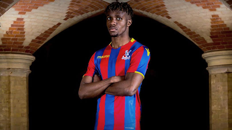
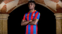
14. Crystal Palace
A lesson in how to add a little alternative colour without messing around with things excessively. The small dabs of yellow are a lovely touch, and Palace's away kit is even nicer, a sort of variation on the classic Sampdoria theme. Sadly, all efforts from the designers are ruined by an abomination of a sponsor's logo. They might as well be wearing bin bags.

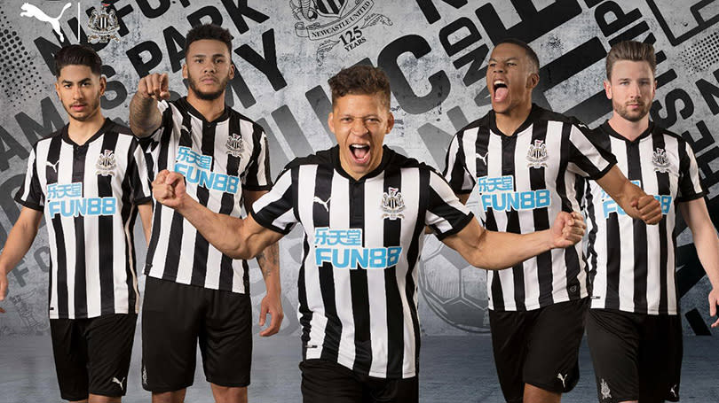
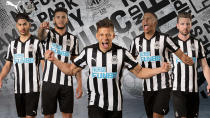
13. Newcastle
Newcastle usually go for a slightly thicker stripe, but this is a valiant effort once more scuppered by a hideous massive sponsor. Weirdly – and it's tricky to explain why – despite essentially being a basic black-and-white striped effort, this doesn't really look like a Newcastle shirt.

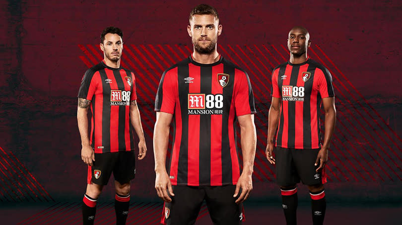
12. Bournemouth
There's a fine line between 'less is more' and 'just copying last season and adding a bit'. A little unfair perhaps, as Umbro have taken the reins this season, but all they seem to have done is make the stripes a bit thinner and extended the black bar down the arms. Still, pleasant simplicity.

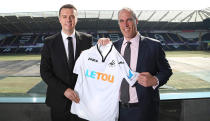
11. Stoke
Not really sure where the red, white and blue stripes around the collar have come from, unless it's a subtle nod to the French electorate for rejecting far-right politics. Still, it does look rather nice – if only they could have made the stripes near the armpit a bit more evenly-spaced.

10. Arsenal
A shade darker than last year (to reflect one half of their club crest, lest it feel left out), Arsenal's home jersey also features a collar that is impressively both pointless and somehow also too busy. Remains the Premier League shirt that most looks like it's painted on.

9. Brighton
A little uncertain about the need for the baby blue sleeves, but perhaps the most impressive thing about Brighton's new top is how they've managed to incorporate a massive great sponsor without it looking completely ghastly. Well done.

8. Watford
Ah, the yellow with red works perfectly with the old adidas stripes – which makes you wonder why they haven't thought of this before. The only issue is the sponsor, which looks like someone accidentally enlarged the font size and absent-mindedly pressed 'send' to the manufacturers.

7. West Brom
Pretty good, no complaints, and hats off for solving the age-old problem of how to make numbers and names show up on the back of striped shirts... by simply eliminating the stripes. However, the away kit is delicious, and blows all others on this list out of the water.

6. Southampton
A departure from the usual stripes, the old 'reverse Ajax' option does actually look quite nice – although you are left with the nagging feeling that the large white panel down the middle was gently suggested by sponsors Virgin to make their logo stand out more.

5. Manchester United
The granddad collar is a bit weird, but the incorporation of the small black bits that most good United shirts have has been very nicely done. There’s a slight nagging feeling that this is just the Chelsea kit from a couple of years ago repurposed, and also the grey away kit is going to inspire lots of tedium, but this alone works nicely.

= 2. Chelsea, Tottenham and Manchester City
The thing about having your shirt made by Nike is you know it will look really good, but also that it will look like every other shirt made by Nike. It's the little black dress of football shirts; the crisp white dress shirt; the Converse trainer.


Still, all three are nice and clean, and the sponsors don't look too bad on any of them – even Tottenham's giant logo. A little more imagination might have been good, mind, so these three are grouped together on the basis that they're basically the same.
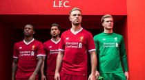
1. Liverpool
Lovely. Ideally you'd maybe want the collar to be a little smaller, and Liverpool's kits always benefit from more orange/gold trim, but that's nit-picking. The slightly darker shade of red really works too. Phil Coutinho will look a delight in this.

